Client: SEMA (Specialty Equipment Market Association), 7,000+ member companies. Timeline: 2025 – 2026.
This page is about the association site, sema.org. The semashow.com architecture is a separate project: read it here.
The situation: a flagship site that didn't sell membership
The site was a brochure in front of a $52B industry. Eight flat nav items plus five utility links. A membership page made of twelve photo tiles with no dues and no way to join. Events in one flat list. Councils on a separate microsite. Thirty-plus stylesheets and twenty-plus scripts on every page, no accessibility statement, and a developer needed for every content change.
What I did: the audit, the case, and the review loop
I made the problem visible before anyone was asked to fund a fix. I went through the site page by page and wrote down what each one was failing to do, with the old page captured next to what it should become. That comparison is the document on this page.
The engineering half of this story is on the semashow.com page — I designed and built that architecture: Drupal 11, headless Astro, the design system, the SEO-parity suite. Read it →
Once the redesign was approved, I stayed on the client side: reviewing the vendor's concepts against the audit, and bringing what our editors and leadership needed into the design before it was built.
Results
The comparison below is the same document I used to get the project approved. Here is what it shows now that the new site is built.
- Lighter pages. 30+ stylesheets and 20+ scripts per page came down to 4 and 12.
- Every image described. One page had 32 images with no alt text. Now zero.
- A membership page that sells. The old one was 12 tiles and no copy. The new one has dues, benefits in six categories, an FAQ, and two places to join.
- Events people can find. Show and Fest are featured. Everything else is grouped by month with a time and a location.
- Councils inside the site. They lived on a separate microsite. Now they are part of sema.org.
- An accessibility statement where there was none, with automated checks running in every build.
- No developer in the loop. Content owners publish on their own.
A short list of content items is still being closed out with the team before launch.
Before and after, seven pages
Each frame is the old page on the left and the new build on the right, above the fold on desktop. Old pages are the live sema.org as it stood; new pages are the rebuilt site. Both captured 2026-10-12 at the same width.
Home
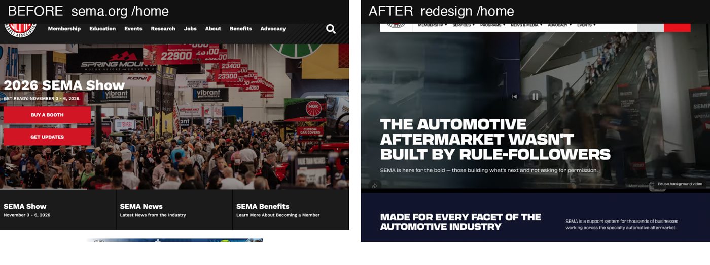
A flat eight-item nav plus five utility links became six grouped menus, each with an overview page. The show-photo hero became an audience section ("Made for every facet of the automotive industry"), benefits by category, latest news and upcoming events. The banners are gone. I raised one decision for the team: the Show CTA left the hero, and three weeks before the Show that should be a choice made on purpose.
Membership
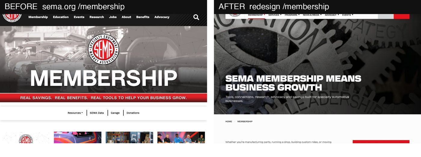
The biggest single win. Twelve tiles became a dues range, a "Join SEMA today" box, benefits in six tabs (Events & Networking, Advocacy, Tech & Testing, Data, Discount Partners, Education), an application band and a FAQ.
Events
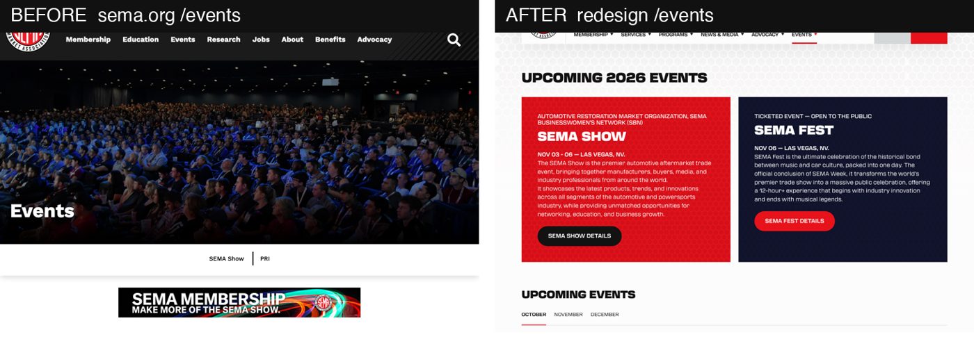
One flat list became the SEMA Show and SEMA Fest featured, month tabs, time and location on every row, and category tiles. The audit also caught that only 9 of 23 events had migrated — flagged and tracked so launch ships with the full calendar.
Councils and networks
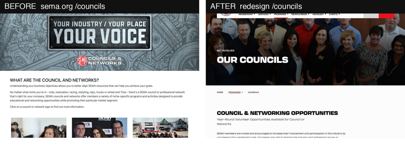
A separate microsite moved inside the main site, with Councils and Networks tabs and a row per council with a blurb and a Learn More. Tracked for launch: the director contact cards the old page had.
News
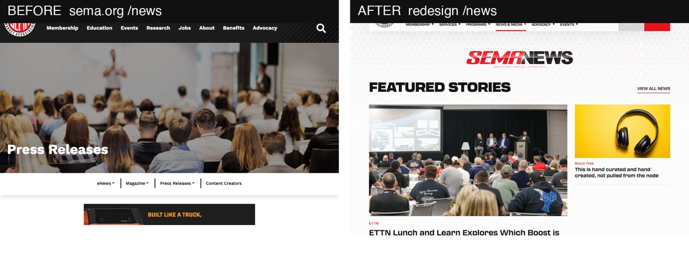
A press-release page became a magazine-style hub: featured story, trending, a recent list, eight categories and a magazine request. Tracked for launch: a visible home for press contacts and press kits.
Advocacy
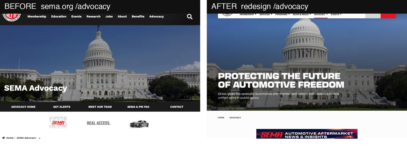
Same content, now in alternating navy, white, grey and red sections so it scans, with a PAC section added. Tracked for launch: the "Get Alerts" sign-up returns to the sub-nav.
About
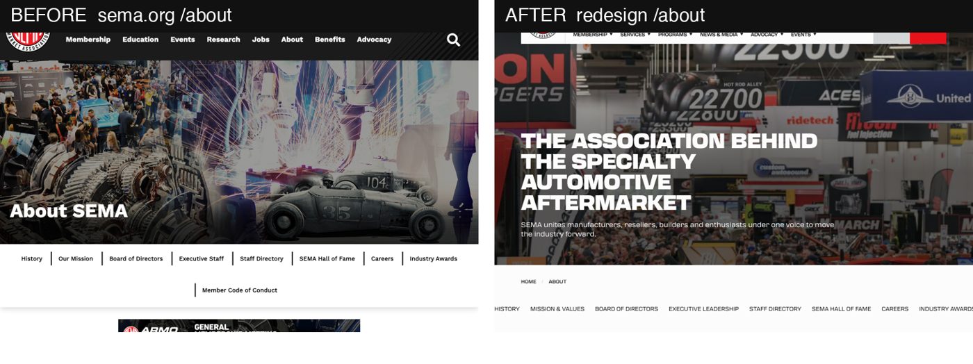
A text column became stats (7,000+ member companies, $52B+ market), a carousel and a "Become a Member" band. The strongest mobile moment on the new site.
Mobile
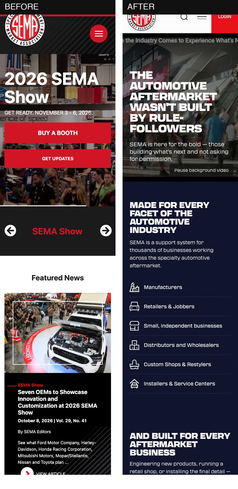
Measured, not eyeballed: no horizontal overflow on either site at 390px. The new site does more on a phone: who it's for on screen one, events by month, a blurb per council, one full-width join button.
What changed under the hood
| Before | After | |
|---|---|---|
| Platform | Drupal theme, per-section templates | Drupal 11 content, Astro front end on Cloudflare |
| Stylesheets / scripts per page | 30+ / 20+ | 4 / 12 |
| Images | No lazy load, no WebP/AVIF, 32 missing alt on one page | CDN, AVIF/WebP, lazy, alt on every image sampled |
| Accessibility | No statement | Accessibility statement page, automated checks in the build |
| Editing | Developer required | Content owners publish themselves |